

Website conversion rates average around 2 percent.
For every 100 visitors, the average site can expect to only get 2 customers. And honestly, that’s a pretty good conversion rate.
Many sites only have a 0.1 to 0.2% conversion rate. That takes 1,000 visitors to get 1 customer.
That’s a tough way to make a living online. Better to increase conversion rates and get more customers with the traffic you already have.
What Does It Mean To Increase Conversion Rates?
Your conversion rate is the percentage of visitors who take a desired action on your site, like making a purchase, signing up, registering, or donating.
For example, if 100 people visit a landing page and 4 of them buy, the page has a 4% conversion rate.
Increasing conversion rates means getting more customers or leads from the same amount of traffic.
The reason it’s important is simple: if you can convince a greater share of your existing audience to act, you can grow faster without spending more to bring new people in.
Driving traffic costs money. Paid ads, content creation, and website maintenance all take time and resources. This is why increased conversion rates usually translate directly into higher revenue and better ROI.
Read this post about good conversion rates if any of what I just said seems complex or unfamiliar.
Increase Conversion Rates: Tactical + Strategic Methods
We’re going to jump right into 14 tactical methods for increasing conversion rates. These are $0 steps you can do right now to give your site the best possible chance for a conversion rate lift:
- Add a popup to your site
- Remove unnecessary form fields
- Add testimonials, reviews, and logos
- Remove all distractions
- Make the initial step really easy
- Clarify your value proposition
- Refine ad targeting
- Strengthen your CTA copy
- Create urgency
- Decrease page load time
- Run a quick CRO audit
- Write a better headline
- Align ad copy and landing page
- Try another offer
Then we are going to cover some of the higher effort, strategic methods for boosting conversion rates over the long term.
- A/B, Split and MVT testing
- Offer a money-back guarantee
- Add live chat to your site
- Add alternate payment methods
- Add a third-party signup service
These methods require specialized tools, sign off from multiple departments, or other steps that will take weeks to play out. But if you follow through, these methods enable you to make a strong conversion rate even better.
But first, the quick wins.
Let’s start with the lowest-effort, highest-reward tactics you can use to increase conversion rates on your site.
1. Add a popup to your site
This one change will catapult your conversion rate. And it works on every site I’ve ever tried it on.
I could give you some stats about why using popups to increase conversions is a good idea, but I’ll give you common-sense anecdotal reasoning instead: every single high-performance website uses them.
They are not using popups for fun. It’s all about increasing conversion rates and ensuring that they make the most out of every website visitor.
Use an opt-in popup to snag an email address and offer a discount on their first purchase. The discount might get them past their purchase hesitation today, and if not, you have their email so you can bring them back with additional offers and remarket to them with paid ads.
Here are some quick tips for getting the highest conversion rate from popups:
- Try several lead magnet offers (exclusive deals, premium content, discounts) until you find a winner.
- Put a 30 second delay timer on the pop-up, this keeps them from being annoying
- Make it easy to close the pop-up
- Set a cookie so the pop-up only appears once per user. Most pop-up tools allow you to do this
This combination will give you a huge boost in conversions and keep the complaints to zero. You won’t annoy anyone and you get all the benefits.
Here’s a great example of an opt-in popup I saw visiting Olipop, the healthy prebiotic soda maker that hit $500 million in sales in less than six years.
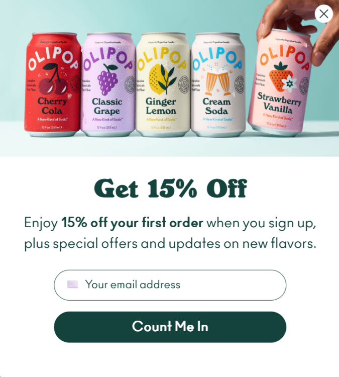
I was probably on the site for about 20 seconds before it appeared, lightbox style, and I had to close it before I could continue browsing. Easy, no worries. This is a good offer with real value (15% discount) and obvious next steps. Just enter my email and click the friendly, “Count Me In,” button to submit.
If you don’t use popups yet, stop reading this post, and go enable them. At the very least, use an exit popup. The impact on your conversions will be so large that you could skip the rest of this list.
2. Remove unnecessary form fields
Have you ever had the intention of filling out an online form, just to be scared away by too many required fields?
It’s one of the best ways to kill your conversion rate. Remove all unnecessary form fields, leaving only those that are essential to accomplishing your goal.
More steps means more opportunities for people to make mistakes. It means more friction in the process.
Look at any study and you’ll find that every extra form field results in a 5-10% drop in conversion rates. Or consider the classic story of how online travel agency Expedia made $12 million by eliminating a single form field.
Obviously, you can take this too far.
There is a bare minimum of information that you need to pick up during checkout, subscriber registration, and lead generation.
For example, if your sales team doesn’t get all the lead info that they need to follow up, your signups could be super high but your close rate will be trash.
So find the right balance between getting the critical lead info while keeping fields to a minimum. Ensure every field plays a vital role. If not, remove it.
3. Add testimonials, reviews, and logos
No one wants to be the first person to use a product or service. So, you can put their mind at ease by providing testimonials and reviews from past customers.
These types of social proof work best when they speak directly to the issues faced by your target audience. Generic praise like, “Your brand is awesome,” is not going to move the needle. You want testimonials that say, “This brand solved my exact problem, and we’re seeing the results they promised.”
Specific testimonials build confidence with an audience that’s dealing with similar problems and desires similar outcomes. Here’s an example testimonial from the home page of Ahrefs, one of the most popular SEO tools:
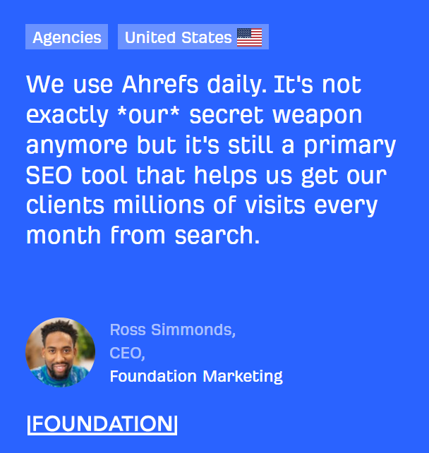
This example is great because it’s a very human quote that plainly states the value Ahrefs delivers, that it “helps us get our clients millions of visits every month from search.”
This is a hyper-specific claim, and it’s framed in the way that an agency thinks about it, not Ahrefs, which makes it more relatable to this type of potential customer.
For homepages, you can also add a series of logos that instantly build trust with new visitors.
Here’s what this looks like on Crazy Egg:
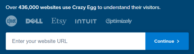
The logos are right above the signup box, with big brand names from multiple verticals reinforcing the idea that Crazy Egg is safe and trusted.
Notice that the logos aren’t in their original color, which would distract from the signup box. I see a lot of websites use this technique and you can be sure Crazy Egg has tested it.
Another nice touch here is the plaintext social proof just above the logos in the claim “Over 436,000 websites use Crazy Egg.”
In B2B, logos are really important for building trust. Keep in mind that most companies have boilerplate language contracts that restrict you from using their logo without their permission.
4. Remove all distractions
The quickest way to tank conversions on a landing page is by overwhelming visitors with tons of options and confusing them about what to do next.
When you have multiple CTAs, flashy banner ads, lightbox popups, and a chatbot competing for a user’s attention, they are not going to be able to focus. If you want them to take action, they cannot be too distracted.
Your landing page should be clear, concise, and follow website navigation best practices. Don’t feel the need to break new ground in terms of design. It’s usually better to go with an obvious layout that people are familiar with.
Stick to the essentials: a great headline, a few key supporting benefits, a strong visual with context, and some customer testimonials that prove you can deliver.
Secondary offers, slide-in popups, and other features can be extremely valuable, so long as they aren’t taking away from the conversion opportunity you really care about.
When in doubt, cut. The simpler the page, the easier it is for visitors to say “yes” to your offer.
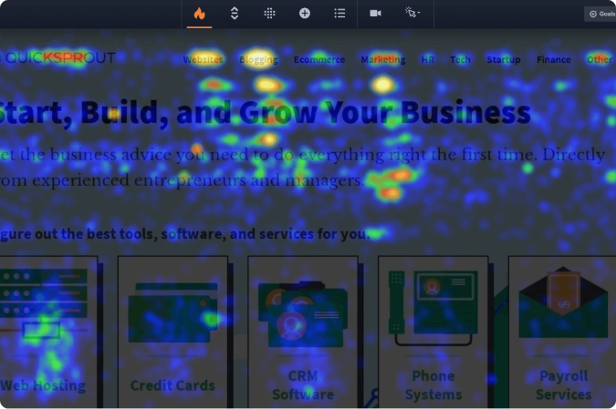
But how do you tell if something is distracting?
Website click maps are a great way to see what elements website visitors are focused on, and which they ignore:

The first time I use a click map, I look for elements that people aren’t clicking on. If visitors aren’t using it, I delete it!
In almost every case, the page gets simpler and my conversion rates go up.
This is one of the easiest ways to find conversion increases on the critical pages of your site.
And when you find people clicking on elements that you don’t care about, you can remove those, too. Crazy Egg tracks “dead clicks” on page elements that don’t do anything, and rage clicks where people keep clicking the same place over and over.
These wasted clicks signal frustration, and adjusting your site after click map analysis can help you deliver a better user experience and increase conversion rates.
5. Make the initial step really easy
There’s a psychological principle that humans prefer to finish things that they start.
So, when it comes to your offer, the first step should be extremely simple to complete.
Instead of asking for an entire form to be filled out, simply request an email address to start.
From there, you can provide the rest of the form in hopes of securing additional information. But even if you don’t, you still have the person’s email.
The easier you make the initial step, the greater chance there is of your visitors taking action and following through to the end. Look at any good landing page example, and you will see they have made the signup process as painless as possible.
6. Clarify your value proposition
The value proposition is the reason why people are supposed to take action on your site. It’s the benefit that your solution provides, clearly stated in a way that the potential customer can easily understand.
You don’t have to be clever or creative to craft a very effective value proposition. You just have to speak directly to the things that your website audience cares about.
Consider the value proposition from email marketing platform, Mailchimp, on this page I discovered after searching for “free landing page builders”.
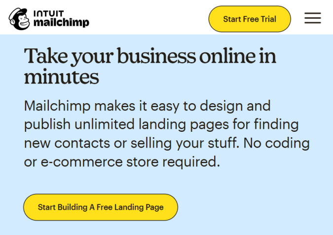
The headline “Take your business online in minutes” speaks directly to the aspirations of people who are looking for a fast and free way to build a landing page.
The copywriting develops this simple idea. “Mailchimp makes it easy to design and publish unlimited landing pages for finding new contacts or selling your stuff. No coding or e-commerce store required.”
In about 30 words, they have positioned this product as capable of handling both lead generation and sales, though they use more beginner-friendly terminology, “finding new contacts” and “selling your stuff.”
None of this stuff is rocket science. It starts with really understanding your target audience and what they care about. Proposing the value your brand offers in clear terms that resonate with your audience is one of the cheapest, fastest, and lowest-tech ways to increase the number of people you convert.
And if you’re not sure what to write, ask ChatGPT, Claude, or another LLM to give you a ton of ideas. Prompt it with the nuts and bolts of what you want, and pick the ideas you’re most excited about.
7. Refine ad targeting
If you are bringing traffic to your site with ads, it pays to ensure that you are targeting the best possible audiences.
Ideally, you are constantly validating and refining your ad targeting strategy, but if you are eager to create a high-converting landing page, then this is a must-do.
First, look inward. Tools like Google Analytics 4 (GA4) or Crazy Egg can show you which channels consistently deliver the best conversion rates. This can help you prioritize ad spend on the platforms that are driving signups and sales, and deprioritize those that are bringing traffic that is less interested in your offer.
Dig into your top-performing pages and see which topics, keywords, or offers attract visitors who actually buy or sign up. Set up a custom dashboard in GA4 to help you identify the traits of traffic that converts well.
Then, jump into the ad platforms. For B2B, platforms like LinkedIn Sales Navigator let you narrow by job title, company size, and more. For B2C, platforms like Meta Ads Manager allow you to target highly specific demographics and psychographics.
Are your settings aligned with what you hypothesize to be true about your audience today?
From there, bring those insights back into your ad strategy. For example, if you see that a certain blog topic attracts high-value leads, you can build ad campaigns around that theme, or use it to create lookalike audiences.
The goal is to create a feedback loop where data from your own site improves the efficiency of your paid campaigns.
The payoff is straightforward: higher-quality traffic translates to higher conversion rates, which compounds across every stage of your funnel.
8. Strengthen your CTA copy
Generic CTAs like “Sign up” and “Start trial” won’t give you the best conversion rates.
A few minutes spent improving the copy will give you an easy conversion rate win.
Here’s an easy trick. Start with a CTA that starts with the word “Yes.” It’s highly effective psychologically because it paints the offer in a positive light.
Try this formula: Yes, I want (your offer)!
Yes, I want the first chapter for free! Yes, I want a 15% discount!
Even these simple improvements are a lot better than generic CTA copy, which is bland and forgettable.
Try mixing in power words to make the CTA more evocative and resonant. I see things like “Shop Hot Deals” instead of just “Shop”. This is not something that should take you more than 10 minutes to do. Here’s a few examples of great CTAs that speak directly to their target audience.
But how do you know which CTA is better?
This is another place where website heatmaps can be really helpful. Heatmaps show you which parts of the site people engage with and ignore, which can be helpful for figuring out whether or not people are interested in your CTA.
Rotate through a few different CTA options to find which one gets the most clicks. Using A/B testing is ideal for really figuring out which CTA performs better, but even a simple heatmap analysis can help you figure out if you are on the right track.
9. Create urgency
People rarely convert when they feel like they can come back any time. Even if they want what you’re offering, there are endless reasons to put it off.
That’s why urgency works: it shifts the decision from “maybe later” to “I need to act now.”
You can think about limited-time offers, flash sales, and “only a few left” notices as gimmicks that aren’t worth your time, but do so at your own peril.
These simple persuasion techniques tap into basic human psychology. When the clock is ticking or availability is shrinking, people naturally place more value on the opportunity. Used thoughtfully, urgency becomes one of the most reliable levers for lifting conversion rates.
Here are some common ways to build urgency into your offers:
- Scarcity: Show limited stock, limited seats, or limited spots available.
- Exclusivity: Highlight that access is restricted to members, subscribers, or early signups.
- Time-sensitivity: Use deadlines, countdown timers, or expiring bonuses to encourage immediate action.
- Loss aversion: Frame what people will miss out on if they wait (savings, bonuses, priority access).
- FOMO: Use social proof (e.g., “200 people signed up today”) to remind visitors that others are acting now.
This is a straightforward example from Wayfair, the online home goods retailer, advertising a “72-hour clearout” sale.
It’s a classic time-sensitive offer. People only have 72 hours to capitalize on the massive 60% discount.
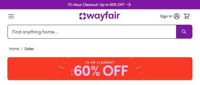
My guess is that this offer will tip the scales for people who are not in dire need of new home goods. Most people can afford to wait on a sofa, tablecloth, or floor lamp, but they are not going to want to miss out on these savings.
10. Decrease page load time
Slow sites hurt your conversion rate because people don’t like to wait for pages to load.
Generally speaking, if your site loads in 2 seconds or less, the page load speed is probably not affecting your conversion rate negatively.
But if your page load speed is in the 3-4 second range or higher, you can probably boost conversion rates by making your site a little faster. Some of the quickest ways to do this include:
- Optimizing images by compressing the file size without sacrificing quality
- Reducing unnecessary scripts, plugins, and code
- Enabling a content delivery network like Cloudflare
Start with these and use a tool like Google PageSpeed Insights to verify that your fixes are resulting in slower load times. There are lots more ways to speed up your site if the easy fixes don’t work.
11. Run a quick CRO audit
A conversion rate optimization (CRO) audit is a fast way to spot performance issues and other problems on your site before you waste traffic.
It means reviewing the basics ensuring that everything on your site is working like it should. You’ll be able to spot broken elements and unnecessary points of friction in key website processes, like signups and checkout flows.
A quick audit gives you a baseline and helps ensure your site is set up to capture the visitors you’re already paying to attract. Read more about running a conversion audit.
12. Write a better headline
Headlines are often the first and only thing people read before deciding whether to stay on your site.
A good one speaks directly to the visitor, makes the value clear, and invites them to keep scrolling.
Weak headlines, on the other hand, drive people away immediately, which causes a high bounce rate.
So how do you write good headlines? It has nothing to do with being a “good” writer and everything to do with:
- Understanding how your audience talks and what they care about
- Being clear instead of clever
- Borrowing from proven headline formulas
- Keeping the headline as short as possible
- Using exciting and emotional words vs. bland and cliche words
If you can do these things, it will only take a small amount of imagination for you to come up with the handful of words you need for a headline.
So how do you know if your headlines are good?
There are a few different approaches to testing headlines that don’t require a ton of traffic. These can be helpful if you don’t have enough traffic to run A/B testing, which would be ideal for testing one headline vs. another.
13. Align ad copy and landing page
When someone clicks an ad, they’re expecting the landing page to deliver what that ad promised.
If your ad talks about a discount, the landing page should lead with that discount. If your ad highlights speed or convenience, that message should be front and center.
Where you have alignment, the user starts to build momentum through your website conversion funnel.
The user has already acted, after all. They clicked through your ad to get to your website because they are interested. A landing page needs to build on that interest, not start talking about something completely different.
Misalignment is jarring and makes visitors feel misled, which hurts conversion rates. By aligning ad copy with the landing page, you reduce confusion and make the journey from click to conversion as obvious as possible.
14. Try another offer
Don’t pay so much attention to your landing page design, copy, and related factors that you overlook the importance of choosing the right offer.
This has one of the biggest impacts on conversion rate, as your offer must be appealing to your market.
And your market is changing constantly. Does your existing offer hold value to your audience today?
You can do a little bit of market research or competitor research to make sure that you are still oriented in the right direction. You might also use quick website surveys to find out what visitors think about your offer, or what they would like to see.
If your conversion rate is on the low-side, cycle through different offers until you find something that clicks with your audience.
Longer-term Strategies to Increase Conversion Rates
These methods are all phenomenal ways to boost conversion rates, but they do take time and resources.
I wanted to include them here for people who have checked all the easy boxes and want to drive conversion rates to the next level.
A/B, Split, and MVT testing
Testing is how you move from guessing to knowing what actually improves conversions.
- A/B testing compares two variations of a single page element. For example, one headline vs. another. It’s about isolating a small change and seeing which version converts better.
- Split testing compares two different page designs. For example corporate vs friendly. You’re sending traffic to two completely different pages to see which overall experience wins.
- Multivariate testing (MVT) compares the relative performance of multiple page elements at once. Instead of testing one headline, you test several headlines and several images, measuring which combinations drive the most conversions.
Each approach can help you drive conversion rates higher. You can fine-tune individual elements, test new experiences, and see which combinations of elements get the most people to convert.
A full CRO testing program often uses all three testing methods. You might run a split test to confirm a new layout, use A/B tests to optimize individual elements, and finally layer in multivariate tests to refine how copy, images, and buttons interact.
Offer a money-back guarantee
As marketers and business owners, we know consumers avoid risk. They don’t want to put their money at stake unless they’re reasonably sure they’ll get what they paid for.
A money-back guarantee helps assuage fears and move past objections. It’s an important trust signal that builds credibility with people who don’t know your brand.
If you’re worried about losing all your sales because of returns, don’t be. This is something that many brands offer because it helps them grow. It’s not a charity thing at all.
The key is putting together a clear return policy that explains when refunds are eligible. A few years back, outdoor retailer Backcountry had to ditch their “zero questions asked” policy because it was abused by a small number of idiots. You have to put some guardrails in.
The good news is that money-back guarantees are a well-trodden path. Most ecommerce platforms have built-in tools to help you get set up. You will also be able to find plenty of guidance online from sellers in your market who are happy to share their hard-won experience.
Add live chat to your site
Many visitors want to buy your service but are on the fence. They have a lingering doubt or question that keeps them from taking that last step
Live chat tools are perfect for helping these folks.
Just like a pop-up, live chat tools are easy to add on any site, but they take a little bit more setup. Let’s not pretend that chatbots aren’t annoying a lot of the time.
To set up live chat with conversions in mind, keep the script focused on answering common pre-purchase questions and guiding users toward the next step, whether that’s a checkout button or booking a call.
Start simple. For example, a chatbot on a software site might ask, “Do you want to see pricing or schedule a demo?” and then link directly to those pages.
You can also use chat to pick up emails and critical information for lead generation. Some people would rather just give their email and set up a call with a chatbot vs. filling out a form and waiting for the next step.
Add alternate payment methods
Shoppers abandon carts when they can’t pay the way they want. Adding options like PayPal, Apple Pay, or Klarna removes that barrier and makes checkout easier, which directly boosts conversions.
The tradeoff is that each new method requires setup and signoffs. You need to integrate the new method with your payment processor, update checkout flows, and ensure security standards are met.
If your competitors offer a payment method you do not, it’s an easy win for them.
Add a third-party signup service
Like everyone else, I’m tired of getting a new password, verifying I am a human, and everything else that goes into signing up with a new brand.
Instead of forcing users to create a new profile from scratch, you can add a third-party signup service and let them log in using their Google, Facebook, or other account.
This eliminates the signup form altogether.
As long as you are using a trusted third-party, there is not a ton to worry about. Some users will want to keep accounts separate, but they will still have the option to sign up with your service directly.
Is It Ever Bad to Increase Conversion Rates?
Most of the time, a higher conversion rate is a good thing.
But there are situations where driving the conversion rate up doesn’t actually help the business. For example:
- Costly discounts that win quick sales but shrink margins.
- Low-quality leads from sweepstakes, giveaways, or overly broad offers.
- Aggressive urgency tactics that boost signups but create regret and high churn.
In all of these cases, increasing the conversion rate can actually harm a business. And you’ll see the damage show up in metrics you care about, like decreases to average order value and customer lifetime value. Or maybe churn starts to skyrocket.The key is monitoring the complete conversion funnel so you can see its overall health. Conversion rates tell you a lot, but not the whole story. Driving that number at the expense of profits or customer retention is not healthy for business.
